In digital marketing, your call to action is said to be the part of your advertisement that directs your target audience what they need to be doing once they click on your PPC ad and hit the website or landing page. The simplest and most easy-to-understand example of this call to action is “Shop now”.
The more information your ad provides to your potential customers with the appropriate CTA, the beneficial it is for your pre-planned strategy. Through your CTA, you can let the audience know what to expect when they are going to click on your ad. Here you can prevent the wrong users from clicking through a clear and direct ad message which they might not be interested in. While emphasizing brand strategy, it is crucial to understand what industry-specific phrasings are or how messaging your potential customers will respond to.
The below-mentioned CTAs will help you decide the importance of using it in your landing page or website:-
1. Apply Now
‘Apply Now’ is an introductory CTA regarding any information which offers actionable outcomes. It will suggest your visitor to move ahead and provide directions to use a product when they click on it. “Apply Now” is a good go-to if your website CTA leads towards anything in which the user needs to take action .
2. Sign Up
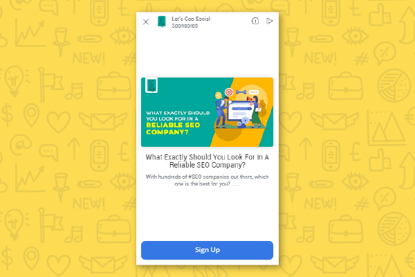 A direct CTA never annoys the user who’s about to click on it. CTA like “Sign Up Free” give out expectations for your visitors by making them aware that they will be able to start using the particular service after the completion of their account set-up. It can also be ‘Sign Up’ if you’re going to make the user pay later on the upcoming checkout page. But if it’s free then do mention it as the CTA makes it evident that there won’t be further charges thereby increasing your conversion rate.
3. Download
 A pretty clear and straightforward CTA, “Download” makes the audience aware that they are going to download something after clicking on it. They are also given a heads-up that they will be signing up for a few forms. Not a very appealing CTA but will help you to increase conversions for your sign-up page. That’s why it’s also very important to consider various design elements for this CTA to work.
4. Learn More
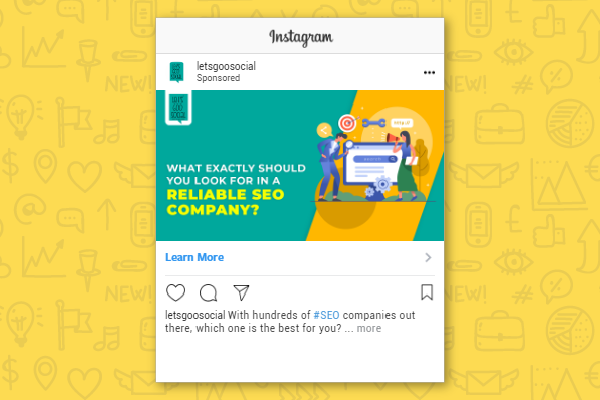 Some products need further explanation for users to comprehend them. If your product needs that, then you need to link your primary CTAs to places like product pages or product tours. “Learn More” is an ideal way to guide the users that they will be directed towards a low-commitment page which will be helping them get more information about the product and how it works.
5. Shop Now
If your brand is into eCommerce, then there’s nothing that works like “Shop Now”. Basically, this CTA is referred to as “Get Started” of CTAs in eCommerce. It is as straightforward as it sounds and lets the users be aware they will be heading into a product page or category page. In the case of multiple products, it’s also good to add the product name or CTA category like “Shop Women’s” or “Shop Clearance”.
6. Get Directions
Considered helpful and friendly, “Get Directions” leads the user to an eventful cause. One of the biggest fear users will be having is that they might get lost. Setting accurate expectations on your CTA prepares the users for the future too. This CTA is important for businesses like Hotels, Cab Rentals, Food Delivery, etc.
7. Contact Us
Being straight-to-the-point isn’t bad but for many eCommerce CTAs, you can try out to give a subtle experience by using “Contact Us”. This is considered great if the product pages turn out like landing pages than basic traditional product pages. It gives visitors information about what they are going to expect after clicking on it.
8. Get Offer
In eCommerce, the “Get Offer” is the second most important CTA on the website after “Shop Now”. This CTA text is common on eCommerce product pages. Before reaching the buy button, visitors must click this on the header of the website. If the visitor clicks on add to cart but doesn’t hit the buy button, then you will be left with an abandoned cart.
9. Get Quote
 It’s always a good option to be direct. “Get Quote” CTA has a lot of intent conveyed when visitors click on it. A lot of the commitment in digital marketing can be overcome when a visitor clicks “Buy Now”. As it focuses on user benefit and brings a positive experience through the product, this “Get Quote” CTA has a positive impact on the audience.
10. Send Message
“Send Message” is very similar to “Contact US” because it’s a common CTA for businesses of all sorts. It’s an ideal option if you’re going to send people to detailed product pages where the users are having further queries about any product or service.
11. Subscribe
The “Subscribe” CTA doesn’t actually commit a person regarding the purchase. It is used for inviting them to receive updates from a particular company. “Subscribe” CTAs are commonly used in company blogs in which the business is determined to develop a readership base. Using “now” after subscribe also creates an urgency among the audience.
12. Book Now
Book Now is a popular CTA that is used when you want users to schedule appointments or make reservations through your Page. Previously, “Book” was used as a CTA but later on in order to create urgency in the minds of the consumer, “Book Now” became a huge success. Remember to warm audiences up with basic information and help them get to know you better. Then test out exploratory CTA’s to see if they work or not.
13. Call Now
“Call Now” is a simple yet appealing CTA on an ad that depicts the reliability of the user with the business. This call to action button leaves the audience at ease where they can know that they can still learn more about the product before signing up for any program. The main aim of this CTA is to make the user feel relaxed and not to burden them with exhaustive information.
14. Donate Now
When constructing a CTA button especially for a non-profit organization, make sure to use powerful and compelling words that attract visitors and drive engagement. “Donate Now” CTA needs a compelling story or an idea that motivates the user to make a generous donation for the cause. Your non-profit can generate constituent leads by using this CTA.
15. Watch More
 If the funnel you’ve customized is to drive in more sales, you’ll likely be benefiting from it more from sending visitors to your appointment/demo-booking page than to any other landing page. If you have a prepared product demo for easy comprehension, you can link to that too using this CTA. This is a more inviting and friendly CTA than Contact or Contact Us which often leaves the user worried.
These compelling CTAs are not the only ones in digital marketing. There are many others that are used for attracting users and drive-in audience engagement. However, these 15 proven words and phrases can be used extensively for your call-to-action buttons. If you want to get access to more CTAs, check it out here.